Plot Count of Accounts by Status Over Time
Source:R/plot_accounts_by_status.R
plot_accounts_by_status.Rd![[Experimental]](figures/lifecycle-experimental.svg)
This function generates a line plot visualizing the counts of accounts by
their status over time. It uses the accounts_by_status() function to
categorize accounts and then creates a plot using ggplot2.
Usage
plot_accounts_by_status(
  data,
  account_id,
  order_date,
  by = "month",
  lost = c("detailed", "simple"),
  force_final_period_complete = FALSE,
  include_cumulative = TRUE
)
Arguments
- data
A data frame or tibble of order information containing at least account IDs and order dates
- account_id, order_date
<
data-masked> columns indatacorresponding to an account identifier and order dates, erspectively- by
The time period resolution. Defaults to "month", but anything supported as a
unitargument for lubridate::floor_date andbyfor seq.Date is an option, e.g. "week", "quarter", "2 months" etc.- lost
either "detailed" or "simple", if "detailed", terminally lost and temporarily lost accounts are shown separately, if "simple", they are combined into a single lost category. Defaults to "detailed".
- force_final_period_complete
Logical, if TRUE, treat the final period as complete even if it may not be. This forces the final period to be displayed with solid lines, even if the period includes dates greater than the final
order_dateindata.- include_cumulative
Logical, if TRUE, include the cumulative account counts in the plot. Defaults to TRUE.
Value
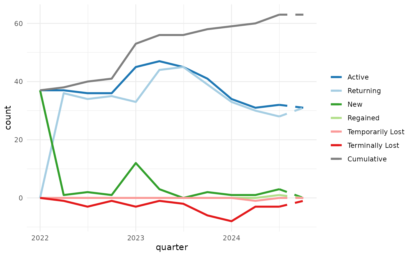
A ggplot2 object: a line plot of the count of accounts of each status
over time (active, new, returning, temporarily lost, terminally lost,
regained, and optionally cumulative). If force_final_period_complete is
FALSE, the final period will be displayed with a dashed line if the period
includes dates greater than the final order_date in data.